Vilunü
Vilunü
Vilunü
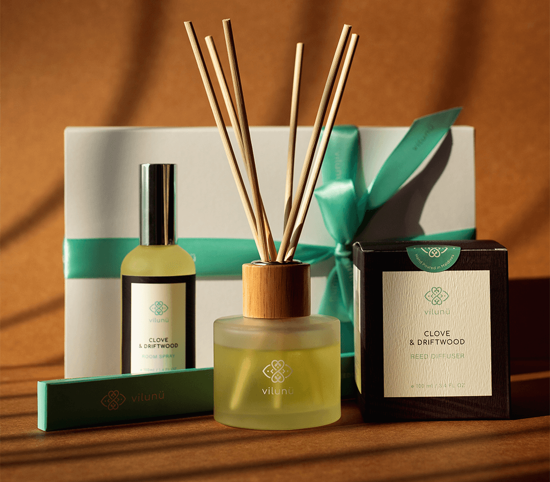
Vilunü is a Maldivian brand that creates its own custom scent blends, coined as the #ScentsOfMaldives. I designed the branding and continue to develop the packaging designs for the brand.
The name Vilunü translates to the turquoise blue colours of Maldivian lagoons, so the brand colour was very much a given from the start.
The logo itself is based on a recurring symbol found in Maldivian stone carvings, tombstones and royal seals. The dots represent salt crystals, as a nod to the origins of the name. The curved shapes, the edges and the two sets of leaves inside the logo, all signify the brand's goal of reviving interest and knowledge of local plants and flora. There’s a much more detailed explanation of the logo, complete with research and references, to read here
Branding Packaging
Branding Packaging
Branding Packaging